
Overview
The OneLern Connect revolutionizes school success management by empowering the S3 Lead to efficiently oversee School Success Specialists (S3s). Addressing manual tracking and decentralization challenges, the app offers real-time calendar access, geolocation tracking, journey step insights, document availability, instant notifications, and streamlined ticket management. Replacing Excel-based methods, it elevates oversight and data analysis. Scalable for team expansion, the app promotes collaboration, propelling improved educational outcomes.
Team
Each member brought their unique skills and experience to the table, and we collaborated effectively to ensure the project's success. I am grateful for the opportunity to have worked alongside such a talented and dedicated team.

Process
I played the role of a product designer throughout this design process. I oversaw and contributed to various crucial steps in the journey, ensuring the product's conceptualization and visual representation align with its intended user experience.

User interview
We conducted two rounds of in-depth user interviews to gain a comprehensive understanding of the needs, challenges, and expectations of key individuals within our user base. These interviews were instrumental in shaping our approach and guiding our design decisions.


Problem statement
The S3 lead faces challenges managing School Success Specialists (S3s) due to inefficient manual tracking methods, reliance on Excel sheets, communication difficulties within the existing management system, and the need to reduce costs associated with using multiple external applications. These issues contribute to inefficiencies, inaccuracies, and a lack of centralized coordination, ultimately impeding effective team management and hindering the expansion of S3s and schools by OneLern.
Goals
- Implement a Centralized Team & Task Management System: Develop and deploy a centralized digital platform or software solution for Team & Task Management, enabling S3 Leads and S3s to efficiently track, assign, and monitor tasks in real-time.
- Enhance Communication and Collaboration: Foster improved communication channels and collaboration tools between S3 Leads, S3s, and other teams to facilitate seamless information sharing, updates, and coordination.
- Automate Task Tracking and Reporting: Introduce automation features within the task management system to automate repetitive tasks, generate reports, and ensure accurate tracking of progress and outcomes.
- Ensure Data Accessibility and Integration: Establish streamlined processes for data accessibility and integration, enabling easy access to critical documents and information across platforms to support decision-making and task execution.
- Implement Task Verification Mechanisms: Develop standardized processes and tools to verify the accuracy and completion of tasks reported by S3s, ensuring data integrity and reducing potential errors.
- Enhance Efficiency and Productivity: Streamline workflows and eliminate redundant manual processes to enhance overall efficiency and productivity for both S3 Leads and S3s, optimizing resource utilization and time management.
- Provide Training and Support: Offer training sessions and continuous support to S3 Leads and S3s on utilizing the new task management system effectively, fostering adoption and maximizing benefits.
Target audience
- School Success Specialist Leads (S3 Leads)
Pain-points
S3 Lead
- Manual task tracking with Excel leads to inefficiencies and inaccuracies in assignment.
- Communication gaps hinder updates and coordination between S3 Leads, S3s, and teams.
- Difficulty accessing critical information across platforms affects decision-making.
- Lack of streamlined verification process for S3 updates leads to errors.
- Absence of centralized task management platform results in disjointed efforts and monitoring difficulties.
- Cumbersome processes waste time and effort, impeding scalability and effectiveness.
- Need for efficient scaling of the S3 team.
- Requirement to reduce costs by minimizing reliance on multiple tools.
- Challenge in managing an increasing number of schools efficiently.
Use Cases
- Dashboard: Displaying overall status and quick menu options for efficient navigation and oversight.
- School Assignment: Easily assign schools to S3s based on capabilities and workload to ensure efficient task distribution.
- Real-time Notifications: Receive instant notifications for critical tasks, support tickets, and location updates to enable prompt response.
- S3 Calendar Access: Access daily calendars of all S3s to know which S3 is assigned to which task.
- Data Visualization: Access visualized data such as school visit frequencies and task completion rates to make informed decisions.
- Overdue Tasks: Provide overdue task dates on each task for clear visibility and proactive management, ensuring timely completion and follow-up.
- S3-wise Task Status: Easily find and check the task statuses of each S3 for monitoring progress and workload management.
- S3 Lead Tasks: Enable S3 Leads to add their own tasks within the system.
Persona creation
After thorough data collection and analysis, we crafted a detailed persona representing the S3 Lead. This persona, named Kishan, embodies the characteristics, responsibilities, and challenges faced by a typical S3 Lead in the field.

Customer journey map
The map was crafted to comprehensively capture the tasks and sub-actions undertaken by our S3 lead in completing their responsibilities, highlighting pain points encountered, and ultimately pinpointing opportunities for enhancement.

Task flows
Following the completion of the user research phases, where we gained a deep understanding of our users' needs, challenges, behaviors, and goals, we developed a list of tasks for our application. We also created task flows for each task to ensure seamless usability and effectiveness.

Application Workflow
After creating individual task flows, we integrated them into a comprehensive workflow that illustrates the entire application from start to finish.

Information architecture
We carefully crafted the application's information architecture, diligently planning each screen and its elements to ensure seamless navigation and intuitive user journeys. Our approach prioritized clarity and organization, ultimately enhancing user engagement and satisfaction.

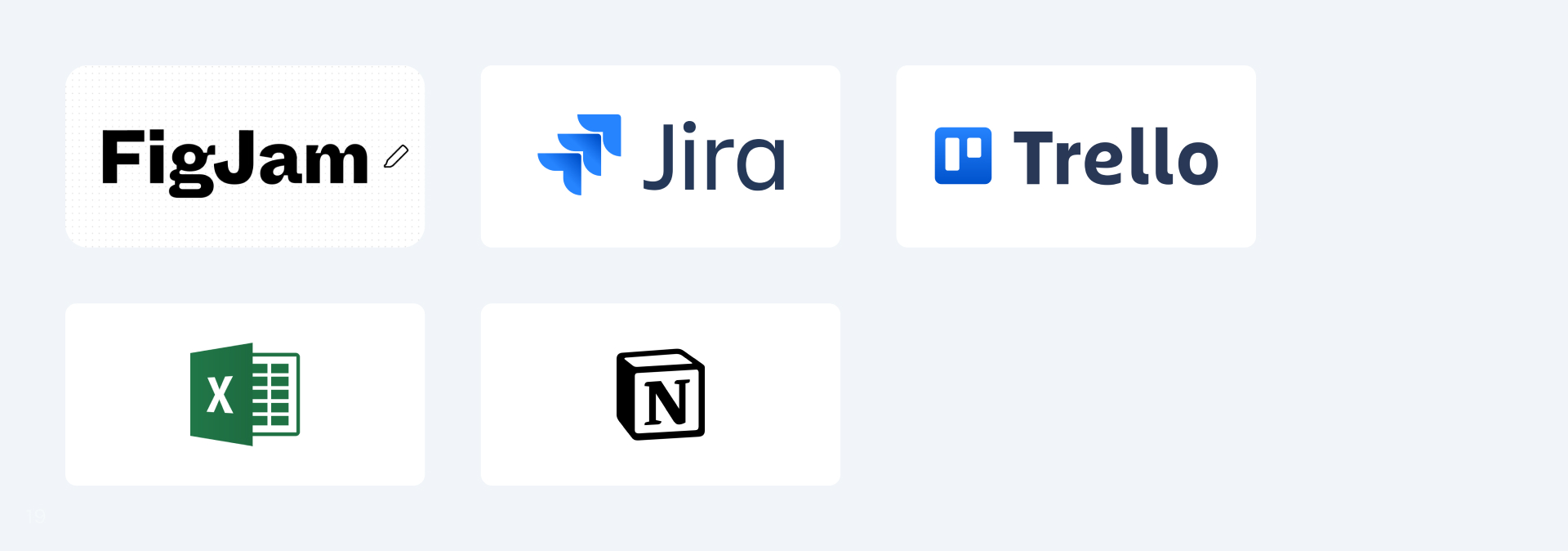
Module Prioritization & Timeline Creation
During the project planning phase, we've set up Module Prioritization & Timelines by dividing modules with another product designer. This collaborative approach ensures effective coordination and progress as we work together. Following are the tools we have used to facilitate this collaboration:
Concept sketches
In order to materialize our design concepts and ideas, we created pen and paper wireframes as a foundational step in our design process. These preliminary sketches served as a rapid and visual way to explore different layouts and arrangements of interface elements.

Moodboard
To crystallize our design vision and direction, we embarked on the creation of mood boards. This crucial step served as a visual exploration of aesthetics, themes, and emotions that we aim to evoke through our design.
Scaling Existing Design System
We have developed new components and scaled our existing design system to incorporate them. After testing these components and variants, we have integrated them into our design system for use in UI creation.

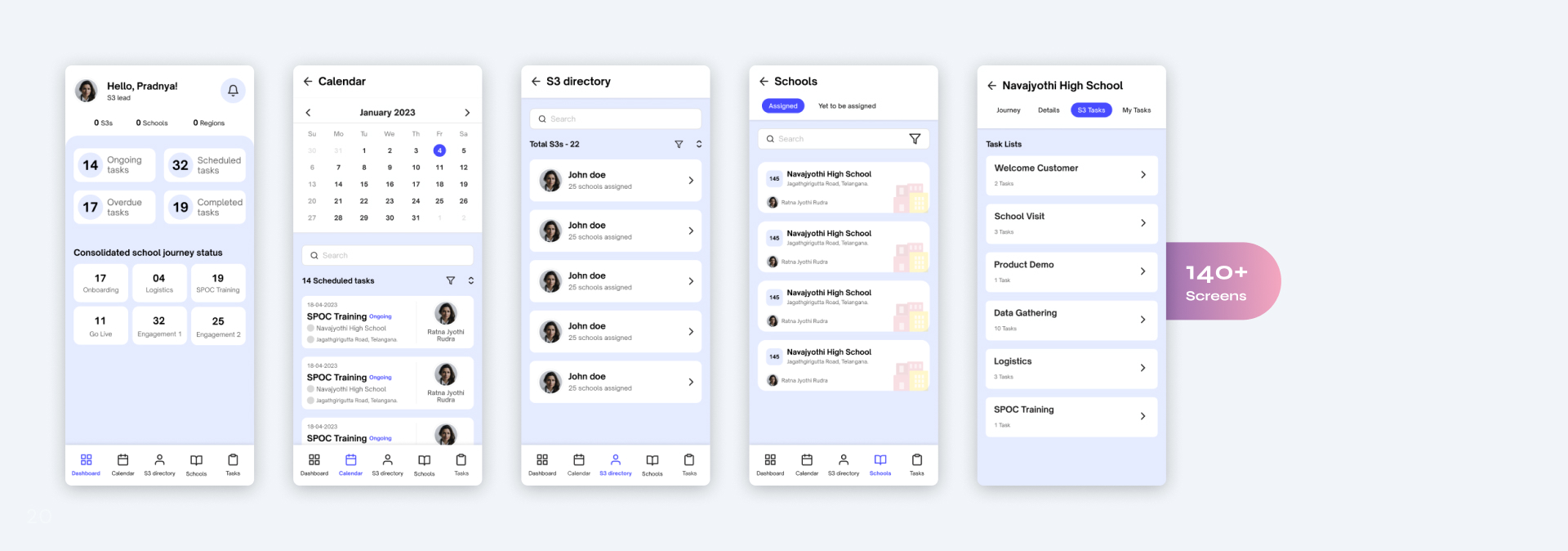
UI Design (Before Usability Testing)
After prioritizing the modules, we proceeded to work on our assigned modules and later integrated them into the complete product. In total, we developed over 140 screens for this product.
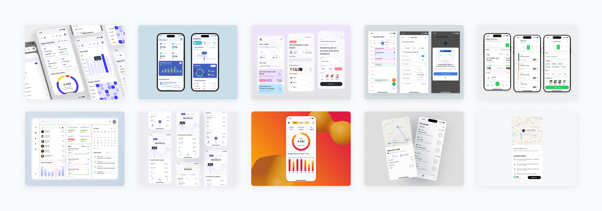
Prototyping
These prototypes serve as dynamic representations of the application's functionalities, enabling us to test and refine our design solutions before implementation.

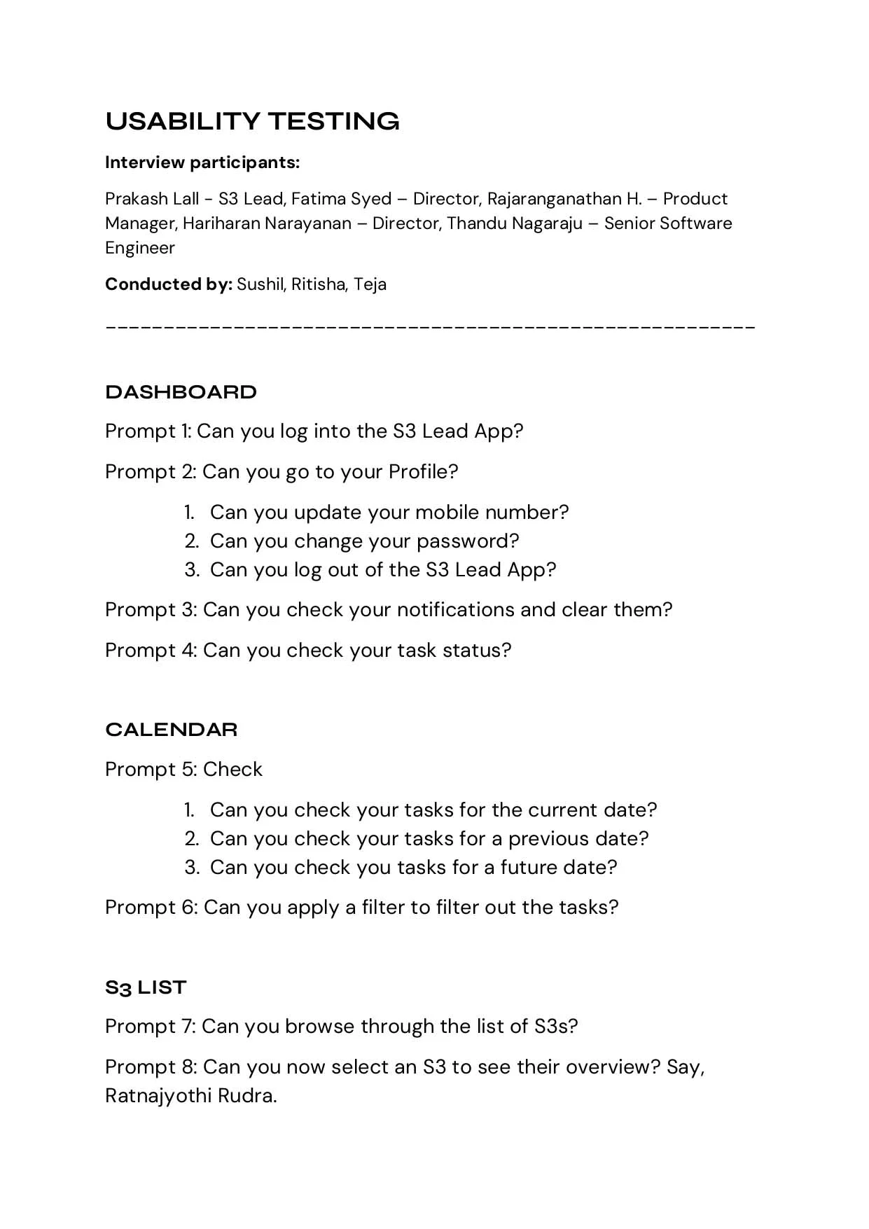
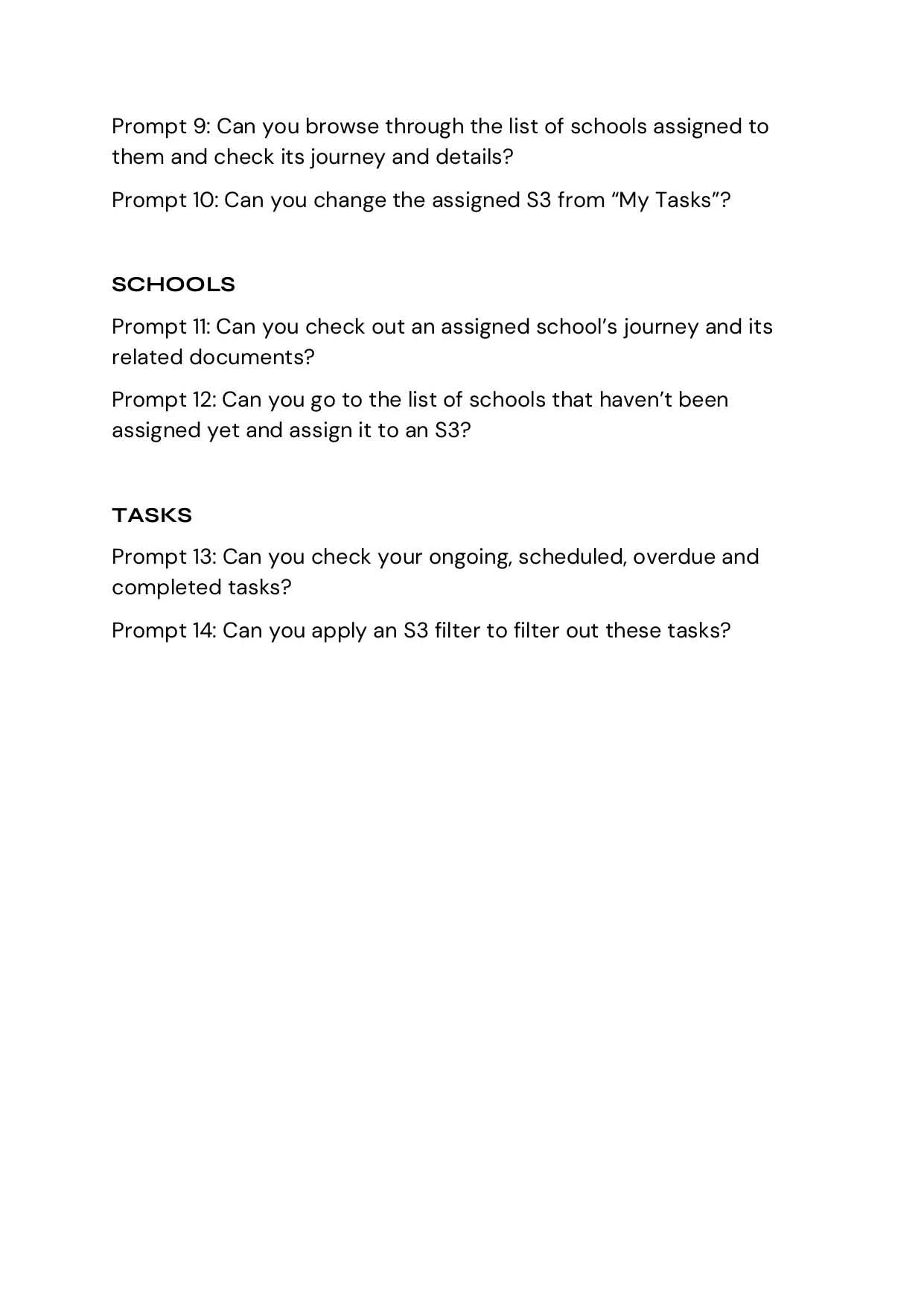
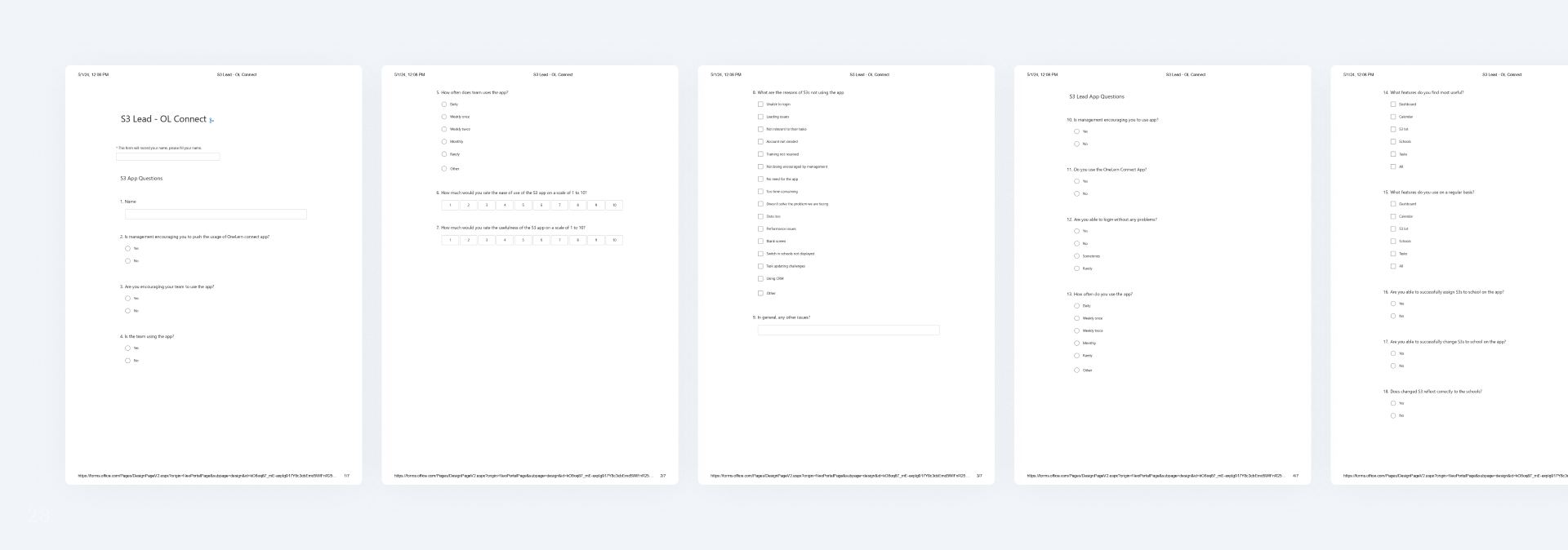
Usability test prompts
This document serves as a structured guide to facilitate usability testing sessions with S3 Leads, allowing us to gain invaluable insights into their interactions with the application.
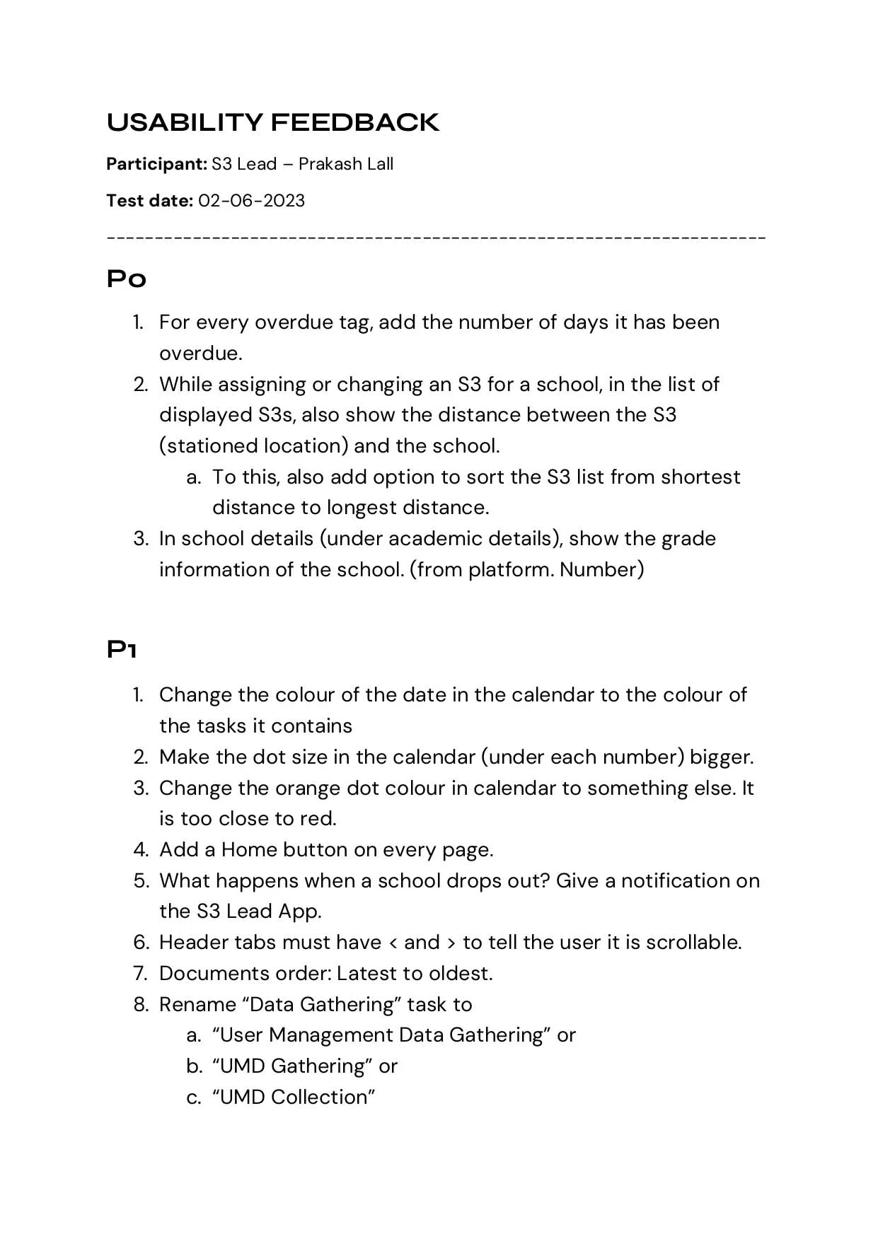
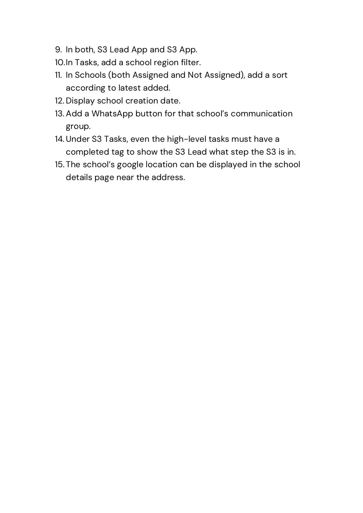
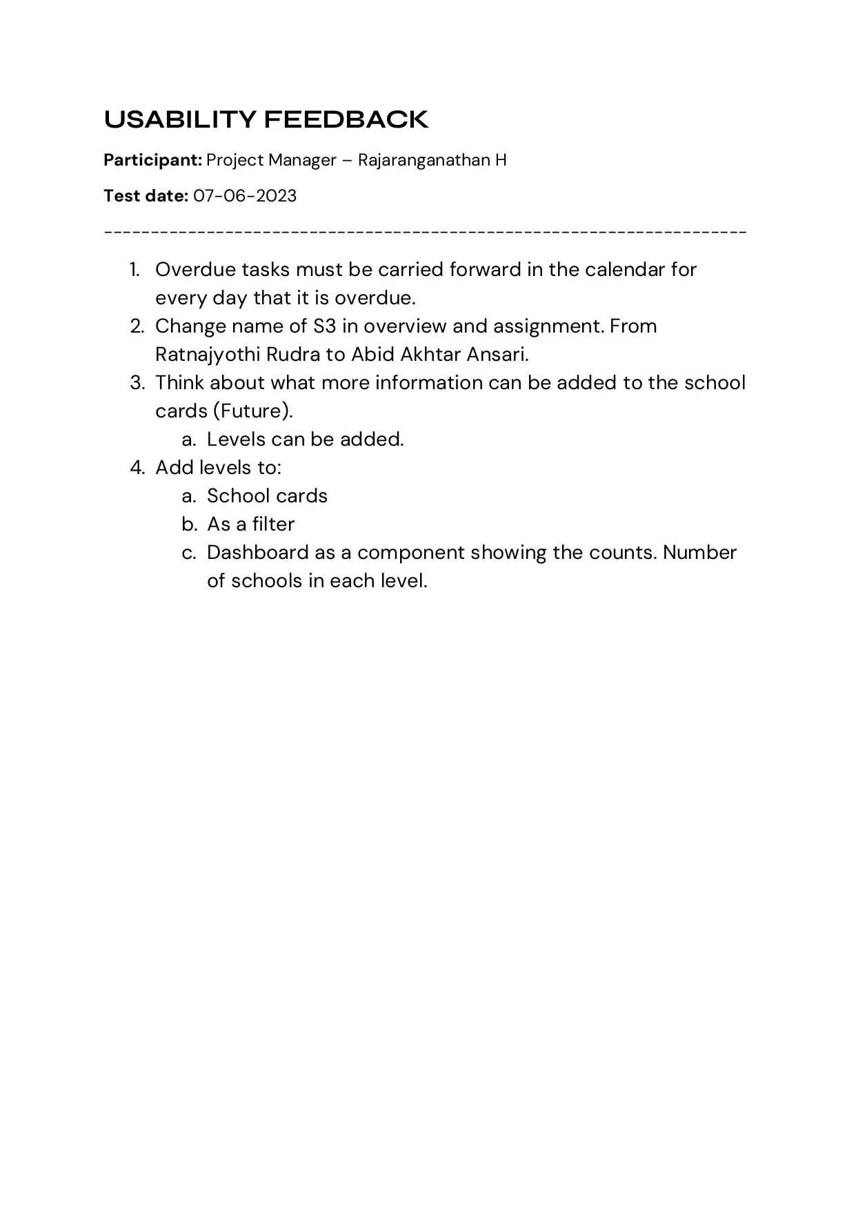
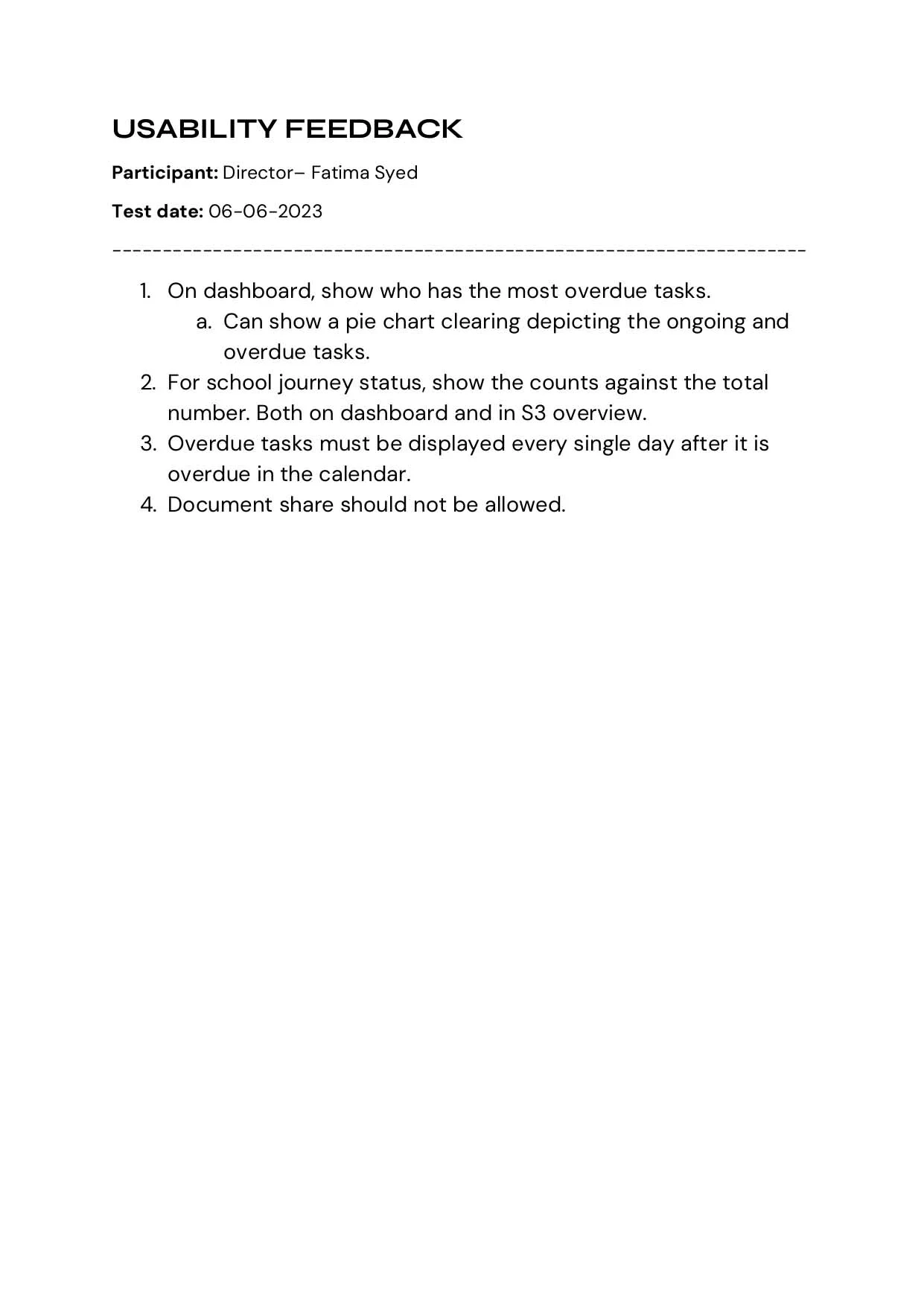
Usability test reports
After conducting comprehensive usability testing with a diverse group of stakeholders, we have compiled a Usability Test Report that provides valuable insights into user interactions, perceptions, and the overall user experience.

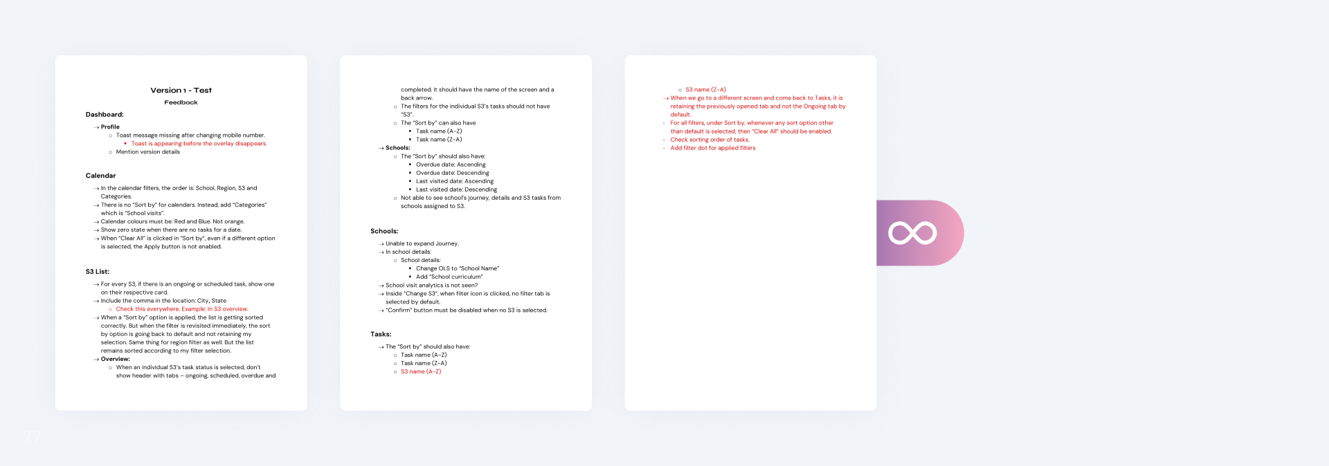
Feedbacks & iterations
Our design journey was marked by a series of iterative steps, each fueled by valuable user-centric feedback. This iterative approach ensured that we continuously refined our design, aligning it more closely with the needs and preferences of the S3 Lead users.
1. Notification icons not reflecting new notifications, S3s, schools, and
region counts not being highlighted, potential issues with displaying task counts in circles as they
grow, and the unclickable appearance of task count blocks.
Solutions:
- Added notification badge.
- Displayed S3s, schools, and region counts with icons, centered for scalability.
- Task count now outside circle, with distinct colors for different tasks.
- Task count blocks have shadows and clickable arrow icons.
2. Display the time gap between S3's previous and next school visits within a 40-day timeframe, and
include the previously completed task with its date in the task list.
Solutions:
- Created an infographic in the UI to display the gap between the previous and upcoming school visits, featuring the days since the last visit, the name of the previous visit, and its date.
- Introduced a text reminder below the infographic, highlighting the importance of adhering to the 40-day timeframe for S3's school visits.
- Implemented a pill component to indicate the task status and included the corresponding date next to it.
3. Move sorting to filters, enhance S3 cards with location and previous tasks, and add numbered labels
to S3 names.
Solutions:
- Enhanced S3 cards: Added location, previous visit/task, ongoing, and completed sections, along with numbers in front of S3 names in cards.
- Sort option moved to filters.
4. Show the location of S3, provide contact details for S3 lead, and ensure consistent use of task
status cards on the dashboard.
Solutions:
- Added the location of S3 below the name.
- Included contact details for S3, along with buttons for calling and emailing.
- Updated the task status cards.

5. Provide task filtering, enhance task date identification, and resolve the issue of mixed status
cards.
Solutions:
- Added filter functionality in the calendar.
- Added dates below dates to show tasks of that day in color according to the task.
- Added pills in task cards to show status and grouped tasks according to ongoing and completed.
6. Tasks should clearly show when they're overdue, include school logos on task cards, display the year
name, and indicate the days until a school visit.
Solutions:
- Highlighted overdue visits in red text.
- Inserted school logos into the cards.
- Included the year name in task cards.
7. Streamlining S3 assignment on this screen, simplifying school discovery for S3 leads, and
identifying schools lacking S3 support pose challenges.
Solutions:
- Added an "Assign" button that will directly take the S3 lead to assign S3 flow for a particular school.
- Added school logos and locations to easily identify schools.
- Added total school counts at the top.
8. The growing task count on tabs presents an issue by expanding the tab's size, and there's a need for
a streamlined method to identify task card statuses.
Solutions:
- Removed the task count from tabs and added it below.
- Added pills to show task status in different colors.

Handoff
To initiate the handoff, we conducted a demo for the tech team on Microsoft Teams and gathered feedback. After approval, we created handoff documents (process, logic, notification, data requirements) in Word and Excel. Screens were transferred from Figma to Zeplin, and Figma access was granted to developers. User stories from the product manager were also validated before development began.
Collaboration with Tech & Feedback
Following the completion of each module, developers conducted product demos. As product designers, we provided feedback on the development progress and assisted developers in resolving any uncertainties they encountered.
Product Adoption Survey
After resolving all development and design issues, the final product was launched and adopted by S3 leads. To validate our solution, we conducted Product Adoption Surveys and received a positive response.
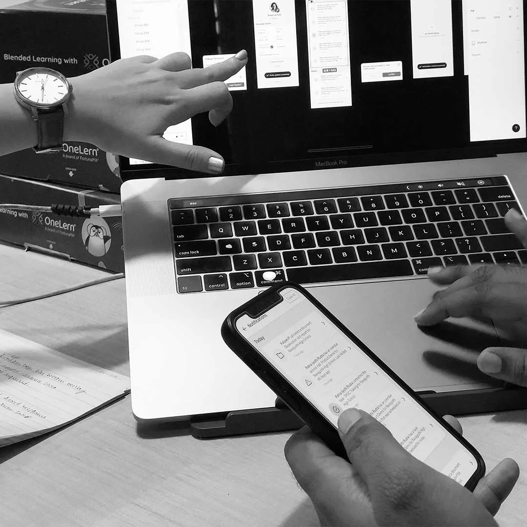
Gallery
This gallery showcases snapshots of our team at work, engaging in user research, design discussions, prototyping, and usability testing.


Future scope
- Real-time S3 Location Tracking: Enable live location tracking of School Success Specialists (S3s) to improve task coordination.
- Expense Upload: Allow easy uploading and management of expense records for financial tracking.
- Document Storage: Implement a secure storage system for critical files and resources.
- Performance Reports Generation: Automate the creation of performance reports for insightful analytics.
- School Year Selection: Add functionality to select and manage specific school years for task planning.
- Subtask Status Tracking: Implement subtask monitoring for detailed task management.
